Redefining Microsoft 365's consumer purchase experience across 4 acquisition channels through standardized UX and a centralized design system, enabling rapid experimentation and knowledge sharing to drive growth.

Office Checkout · Windows Setup checkout
2023-2024
Designer
My role
Working along with another designer, I led the modernisation of Windows setup transaction surface.
I contributed to scaling and improving in-app and web checkout experiences—ensuring design consistency through contributions to the dedicated design system, enhancing usability by aligning with accessibility standards, and driving growth through the release of 12 experiments.
Where things were at
Microsoft 365 consumer subscriptions could be purchased through multiple channels: the Microsoft website, during Windows setup flows for product key redemption, and within pre-installed Win32 applications.
However, these purchasing touch points operated as isolated, disconnected platforms that each required separate maintenance. The underlying legacy codebase constrained experimentation capabilities and prevented the sharing of insights and testing results across the different platforms.
~14.5 M
Monthly visitors
4
Unique transaction channels

Web Checkout

In-app Checkout

Windows 11 Setup Checkout

Windows 10 Setup Checkout
What I've worked on
I've led the modernisation work on the Windows 10 and Windows 11 Setup Checkout, partnering with Windows setup team to ensure consistency.
What users were saying
Additionally, preliminary user research revealed that users questioned the legitimacy of the surfaces due to their outdated user interface.
“The webiste does not look very professional… ”
“Looks a little scamm-y…”
“I'd not sign up on this website…”
“It seems there's much more to read…”
Experience was fragmented and lacked of clarity
The checkout flow faced several trust and usability challenges, leading to higher abandonment rates. Users expressed confusion about the process, highlighting key issues such as:
Absence of a back button to navigate between steps
Lack of clarity on which product was being purchased
Unclear details about when the free trial ends and the subscription cost
Requirement to enter payment information before accessing the free trial, causing concerns about hidden charges and lowering confidence in the process
No clear confirmation page indicating successful completion

Redefined the core pattern
To ensure users about their purchase I've designed a Ux flow defined as One-step-checkout, that will increase clarity about the free trial and reassuring users about time and
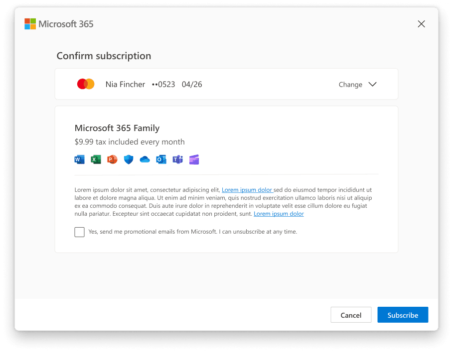
Allowed users to review their subscription one last time after adding their payment method, before starting the trial.
Added a purchase summary with key details about the trial period and subscription price to reassure users.
Created a success screen to provide a clear and celebratory confirmation moment.

Build a shared foundational experience
To standardize the user experience, I contributed to designing a flexible growth framework with versatile components that work seamlessly across all channels, ensuring unified UX and cohesive UI through:

A modular library enabling style adaptation
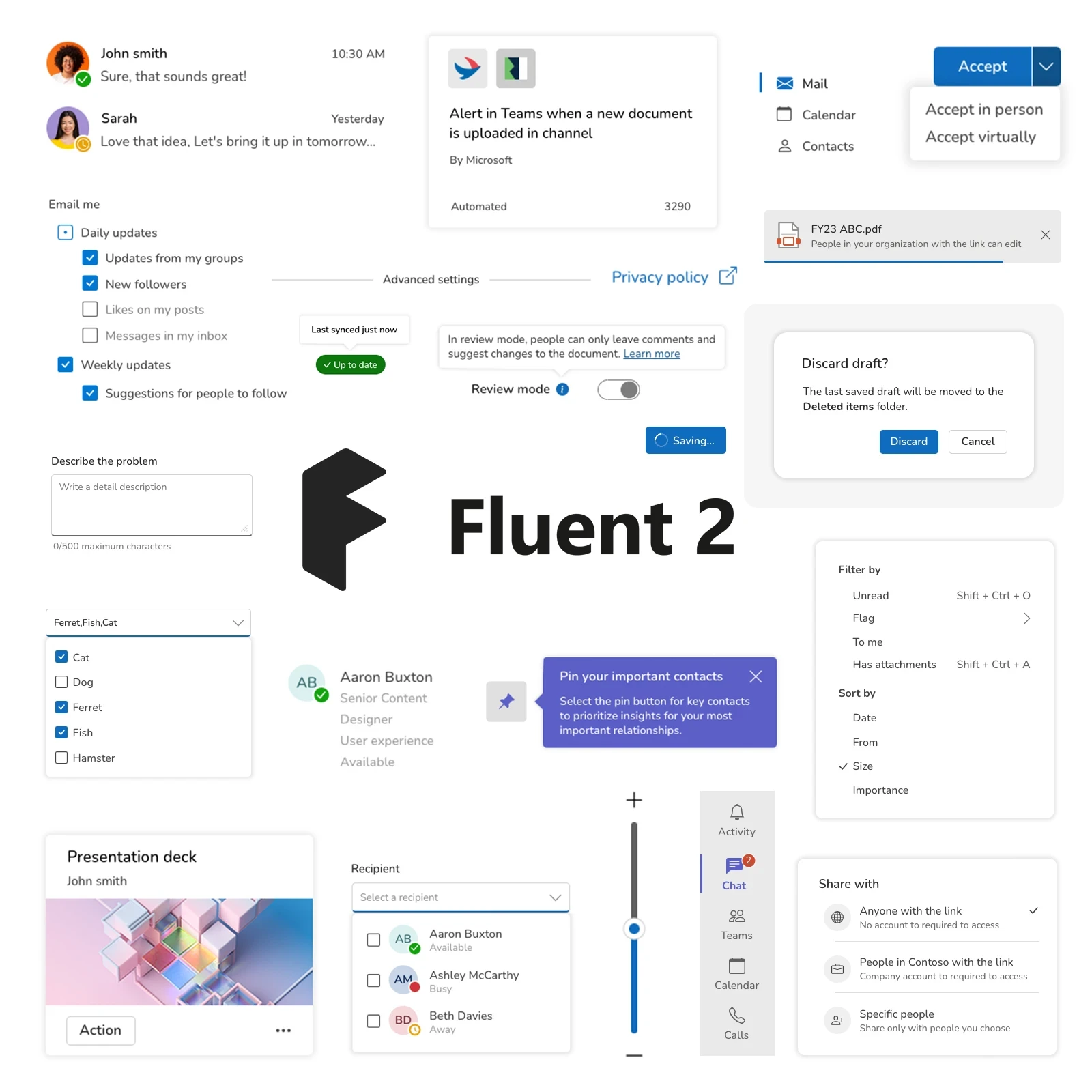
Fluent components enhancing design credibility

React-based components simplifying engineering implementation
Office checkout component library
This effort resulted in a coherent, reusable and responsive component library built to enable growth and easily adapt to every acquisition channel
Applied systematically across channels
By leveraging a cohesive design system, we ensured consistency across acquisition experiences, facilitated knowledge sharing, and enabled quick iteration to drive growth.
The impact
The migration of all acquisition channels was successfully completed in FY24.


What's next?
After the channel migration finished, the product began its experimentation phase, during which I led the upsell strategy and execution,

